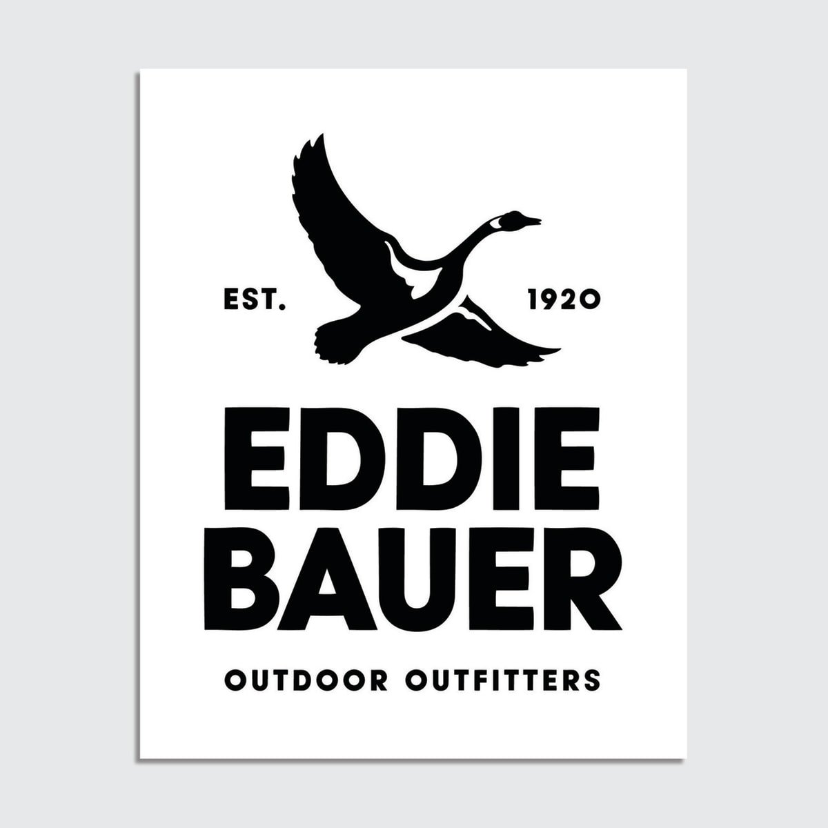
New Eddie Bauer Logo
Just a short time after Johnson & Johnson changed its storied logo, we see outdoor brand/retailer Eddie Bauer make a similar change from a cursive logo to a more block-style format. Like Johnson & Johnson, the original logo was modeled after the founder’s signature. It’s been 59 years since the logo was modified.
There are actually two versions … the one above and the one below which includes the descriptor and founding year.
You may be wondering about the goose? That’s a nod to the brand being the first company to introduce a goose-down jacket. Interesting. Also of note is some of the rationale for the change: younger children no longer learn cursive in school and therefore may have a hard time reading the old logo. Interesting.
The new logo rolls out on digital platforms this week and over the coming months, and then we will also start to see the new look at brick & mortar retail soon. It does look sharp, actually …
Source: Eddie Bauer
I say this all the time … brands have to evolve and change and signal their relevance. For some it can be jarring and dramatic, but then we all quickly get used to the new look. I’m guessing that’s the case here as well.
Certainly sends a signal that Eddie Bauer intends to continue to be a player in what really is a pretty competitive marketplace for outdoor apparel and accessories with some pretty major brands. If one is to complete, one has to keep up!
What’s your experience? JIM


